

Have you ever been on a website quietly reading an article and without warning, something changes? Perhaps the text moved, or an ad appeared out of nowhere interrupting your whole process.
Or in a worst-case scenario, you wanted to click on a link or a button, and at the instant, the layout shifted and you clicked something else? It’s super frustrating, right? This is what you call a “cumulative layout shift” on a website. Similar to other parts of Google’s Core Web Vitals series, where we covered Largest Contentful Paint (LCP), and First Input Delay (FID) —in this article, we’ll cover all you need to know about Cumulative Layout Shift (CLS).
What is Cumulative Layout Shift (CLS)?
The Cumulative Layout Shift, CLS for short, is a Web Core Vital metric that measures how visually stable a website page is. The calculation of this visual stability is based on how many unexpected and unintended layout shifts occur on a web page without a user’s interaction. In simpler terms, every point that the content of a web page changes without your interaction counts as a layout shift.
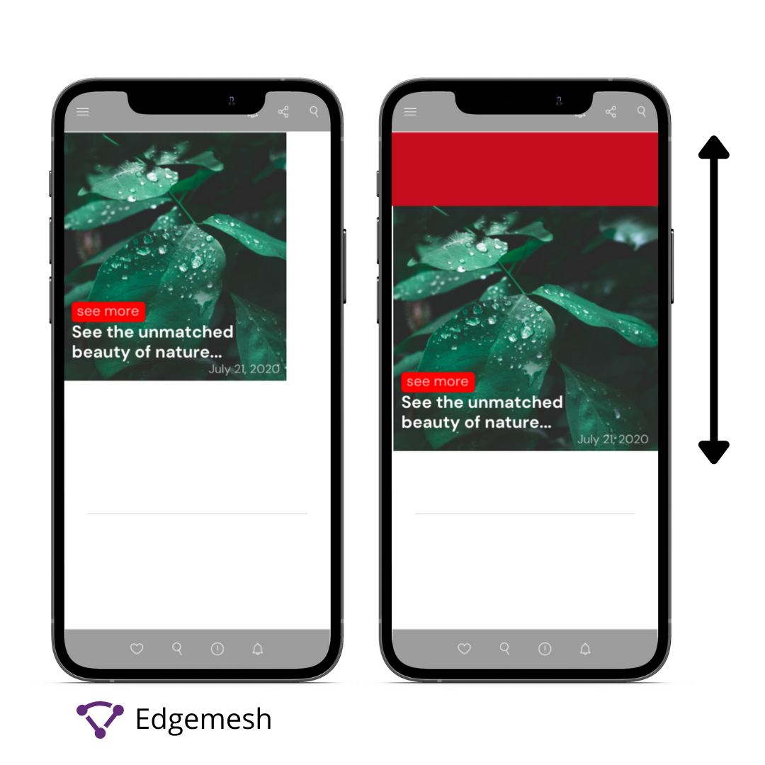
Here’s a quick example of what that looks like:
The reason for these shifts in layout can be attributed to many factors —which we’ll discuss later in this article. The main point is certain elements on a website are unstable, and this causes them to continuously change positions.
According to Philip Walton and Milica Mihajlija of Web.dev, the CLS is made of two essential parts, namely:
- Layout Shift
- Session Window
- Layout Shift
The layout shift of a website occurs any time visible elements change their position from one rendered frame to another.
- Session Window
A session window can be defined as a burst of layout shifts. In this case, it’s when one or more individual layout shifts occur in rapid succession with less than 1 second in between each shift and a maximum of 5 seconds for the total window duration.

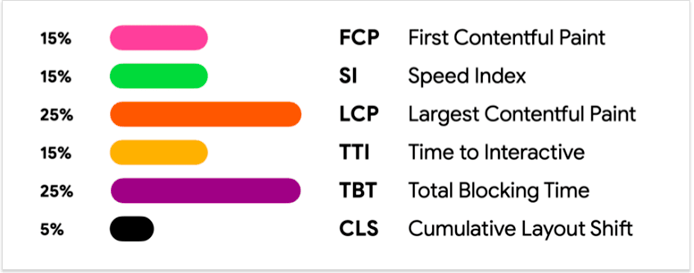
Typically, the influence of the CLS in Google’s Core Web Vitals big 3 is often considered little because it accounts for only 5% of page speed score.
However, as little as that might be, a fast load time won’t help in user experience if the content layout of your page moves around unnecessarily once the page loads.
On the other hand, there are two sides to how layout shifts work —and only one of which counts.
- Expected Shifts
- Unexpected Shifts
Expected vs Unexpected Shifts —Which One Counts?
The big debate between most website developers and conversion rate optimization experts when talking about CLS is — what type of shifts counts in affecting your CLS score?
A direct answer is CLS only measures unexpected shifts. But this can be confusing, so let’s break down how it works.
- Expected Shifts
These are layout shifts that occur due to web visitors’ actions on a web page, i.e., they are user-initiated. An example of this is when you type into a search box of a website and it animates or has a transition style. Another one is opening the navigation menu and it slides from the side.

- Unexpected Shifts
As expected, these are layout shifts that are not user-initiated. A quick example is an ad pop-up, or other integrated design and pop-up elements on a website.
Now that you understand both shifts, the next question is, how does Google differentiate between the two?
Google understands the reaction time of users is based on how much content on a web page is readable and interactive enough. As such, any layout shifts that occur within 0.5 seconds (500ms) of user interaction are not calculated. Unlike the other two Core Web Vitals – LCP and FID — CLS is measured differently. LCP is mostly concerned with how quickly the elements of the page loads and is measured instantly.
The same goes for FID — it measures the delays in interactions on a website and can be measured instantly. Both the LCP and FID are metrics that have the most accurate result, as they only function based on the “initial” time of the test and not over a period of time.
However, CLS is completely different as its measurement is based on the lifespan of the web page involved —hence, the use of “cumulative” in addition to layout shift. As a result of this, typical lab tools like Lighthouse often don’t display the actual CLS score of a website but rather calculate the initial CLS at the particular time the test runs. (We’ll cover more on this later in the article.)
In a practical aspect, the concept of CLS revolves around how much of a web page moves before user interaction and how often that happens. Nonetheless, even though these lab tools don’t accurately measure the visual stability of a page, there are certain numbers from which your CLS (in seconds) should range.
What is A Good CLS Score?
The CLS score of a page tells you how visually stable the web page is as content loads onto it without your (user) interaction. According to Google, the categories of Cumulative Layout Shift are divided into three parts, namely:
Good: A CLS score that is =< 0.1s (100ms)
Needs Improvement: A CLS score that is between 0.1s (100ms) and 0.25s (250ms)
Poor: A CLS score that is above 0.25s (250ms)
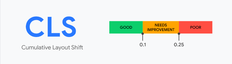
Ideally, you want to have a good CLS score, as it contributes to your overall page load time. Generally, any CLS score below 0.1 is good, and above 0.25 is bad. Although CLS is a crucial part of the Google Page Experience update, it can’t exactly be calculated as a time measure. Rather, it takes on shifting a layout based on its impact and distance in a user’s viewport. With that in mind, the next question is:
How is CLS Score Calculated?
The formula for calculating your CLS Score is:
layout shift score = impact fraction * distance fraction
Below is a breakdown of the formula.
In calculating the CLS score of a web page, the browser takes into account the size of the viewport and the movement of unstable elements in that viewport between two rendered frames.
This score is a result of two measures of that movement taking place:
- Impact Fraction
- Distant Fraction
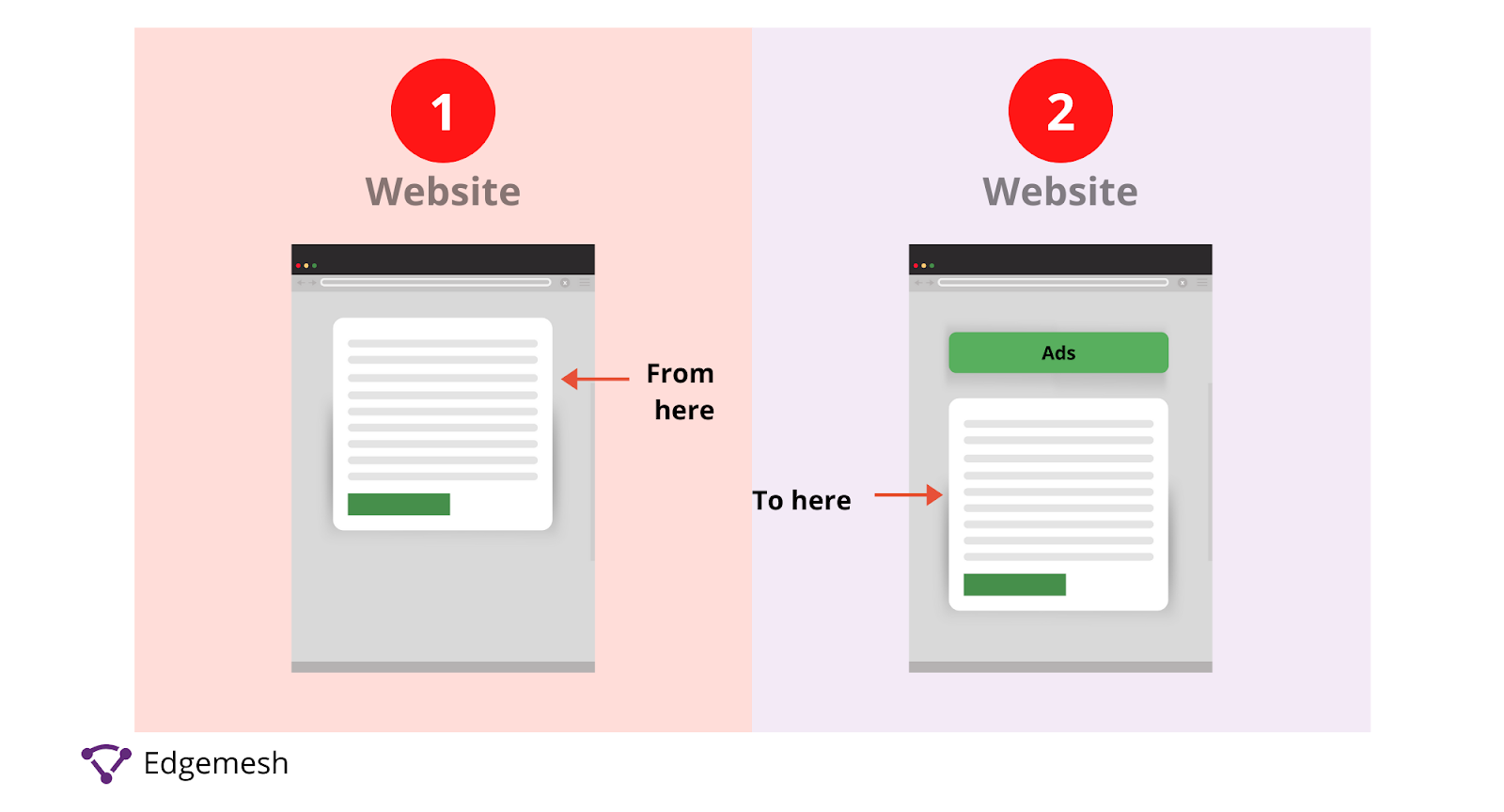
1. Impact Fraction
This measures the amount of space an unstable element takes up or impacts in a viewport area between two frames.
Here’s a graphic example:
- In frame 1, the visual area is taking up a large percentage of the viewport.
- However, the position of the visual area changes in frame 2 when an ad unexpectedly pops up on the page.

- In frame 3, the whole space occupied by both the ad and the new visual area is called the “impact region”— hence, changing the viewport between the two frames.

The formula for impact fraction:
Impact Fraction = Area of Impact Region ÷ Area of Viewport
Practical Example
Let’s say the initial image on the web page below takes up 50% of the viewport. Then later, due to an ad interruption, it shifts by 25% of the viewport —the impact fraction will be 75%, i.e., 0.75.
2. Distance Fraction
This measures the amount of space that an unstable element has moved from its original position to the next frame.
Here’s a graphic example:
- The initial position of the visual element is shown in frame 1.
- In frame 2, an unstable element —in this case, an ad —has occupied a certain part of the viewport, hereby changing the position of the visual element.
The formula for distance fraction:
Distance Fraction = Maximum move distance ÷ Height of Viewport
Practical Example
- Using the above visual element, we can assign a value to the move distance and viewport height.
- Let’s make the move distance = 137 and viewport height = 634
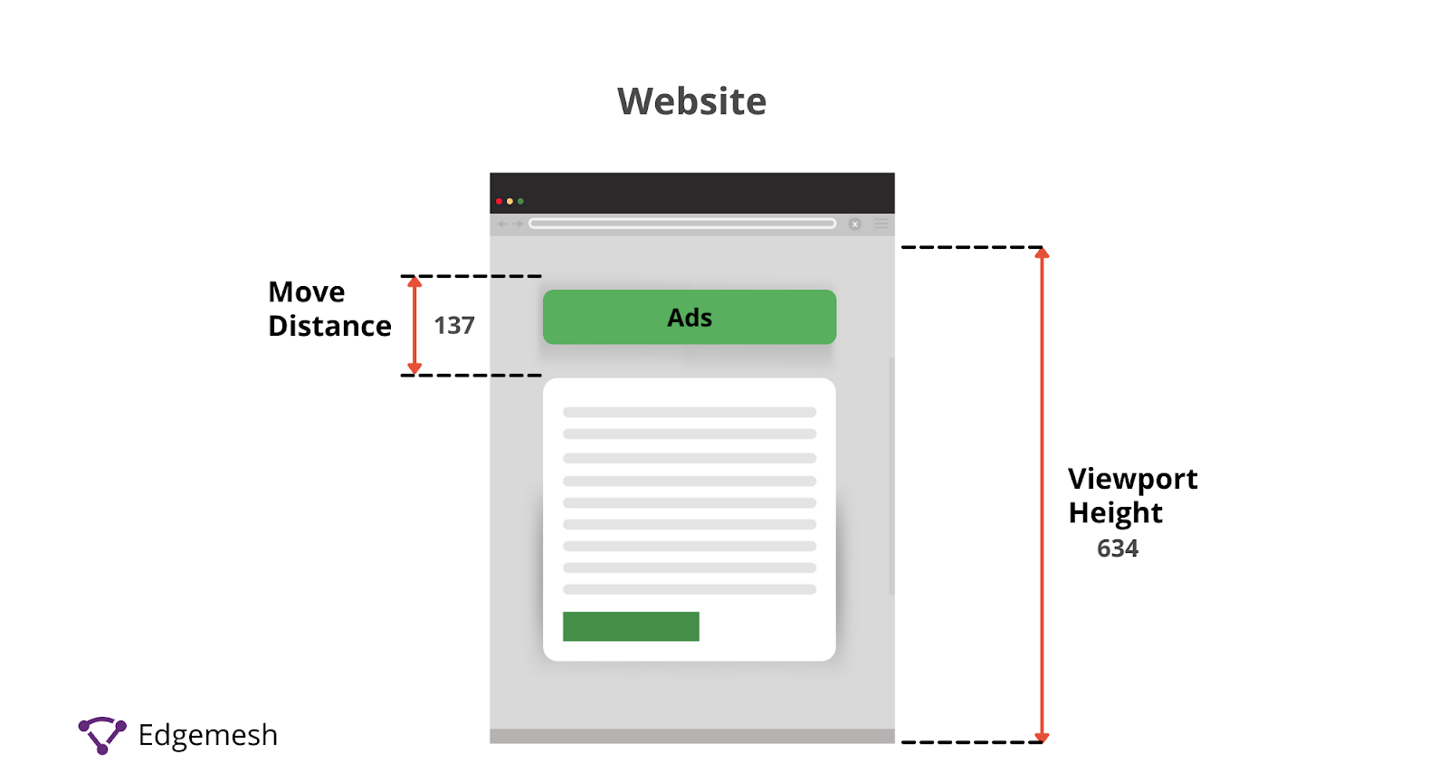
Using the formula:
Distance fraction = 137 ÷ 634 = 0.216
Hence, our distance fraction for this example is 0.216.
Note: CLS score was originally calculated based on impact fraction alone. However, to avoid overly penalizing cases where large elements shift by a small amount, distance fraction was introduced.
How to Measure Your CLS
Like all other Core Web Vital metrics, CLS can be measured with either the Lab Tools or Field Tools. Both methods, to an extent, will give you an almost accurate result —but the way each operates is different. Lab tools for a start load web pages in a simulation relative to the computed algorithm of the tool involved. This means, they only measure the CLS of a web page that occurs during the page load.
Due to this, the values given by the lab tools are in most cases going to be less or higher than real user experiences.
Examples of Lab Tools include:
- WebPage Test
- Chrome Dev Tools
- Lighthouse
Field tools, on the other hand, run a test on the intended web page based on real user experiences while on the page.
Examples of Field Tools include:
- PageSpeed Insights
- Chrome User Experience Report
- Search Console (Core Web Vitals Report)
How to Use Chrome Dev Tools to Find Your CLS
The Chrome Dev Tools comes as an inbuilt section in your Google chrome browser. Apart from being a normal browser, Google has modified the browser to do more than just connecting you to your favorite websites — instead, you can use a certain section to monitor your website.
- Open your chrome browser on your desktop and go to the web address of where you want to measure your LCP and access the performance tab.
- If you’re using Windows, use these combinations — CTRL + SHIFT + I
- If you’re on a Mac, use these combinations — CMD + OPT + I
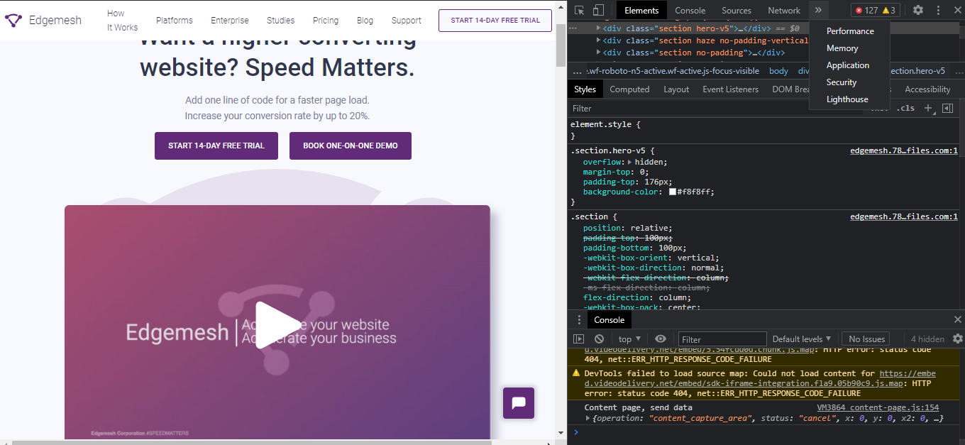
You should have something like this if you did it correctly 👇
Another easier way to access the performance tab in chrome is by simply right-clicking on the web page you want to track—then scroll down and click “Inspect.”
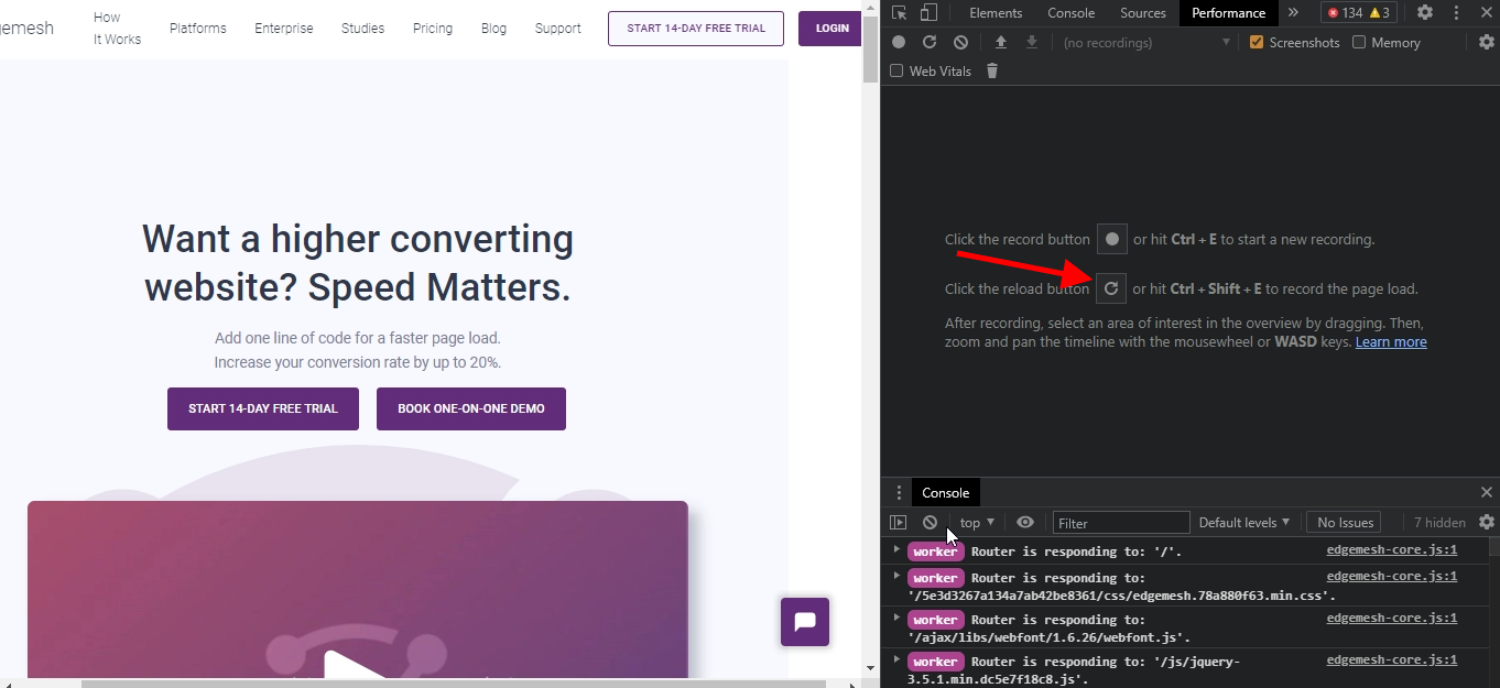
- After opening this on your chrome browser, go to the “Performance” section located at the top of the tab.
- If you don’t see the performance section immediately after you open this tab, click on the “>>” icon.

- By clicking that, you’ll get the following options.
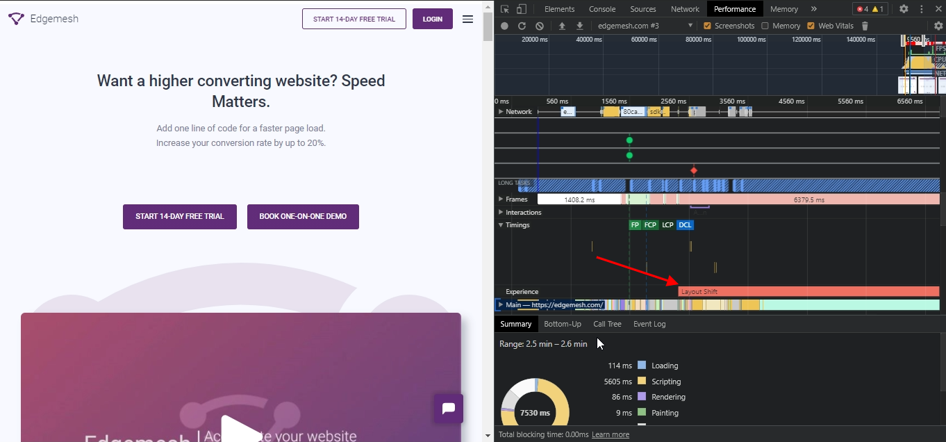
- Click on performance, and when the page loads, click on “record” to measure the CLS.
- When you click the reload option, the tool profiles and reloads the entire website so you can get a more accurate result.
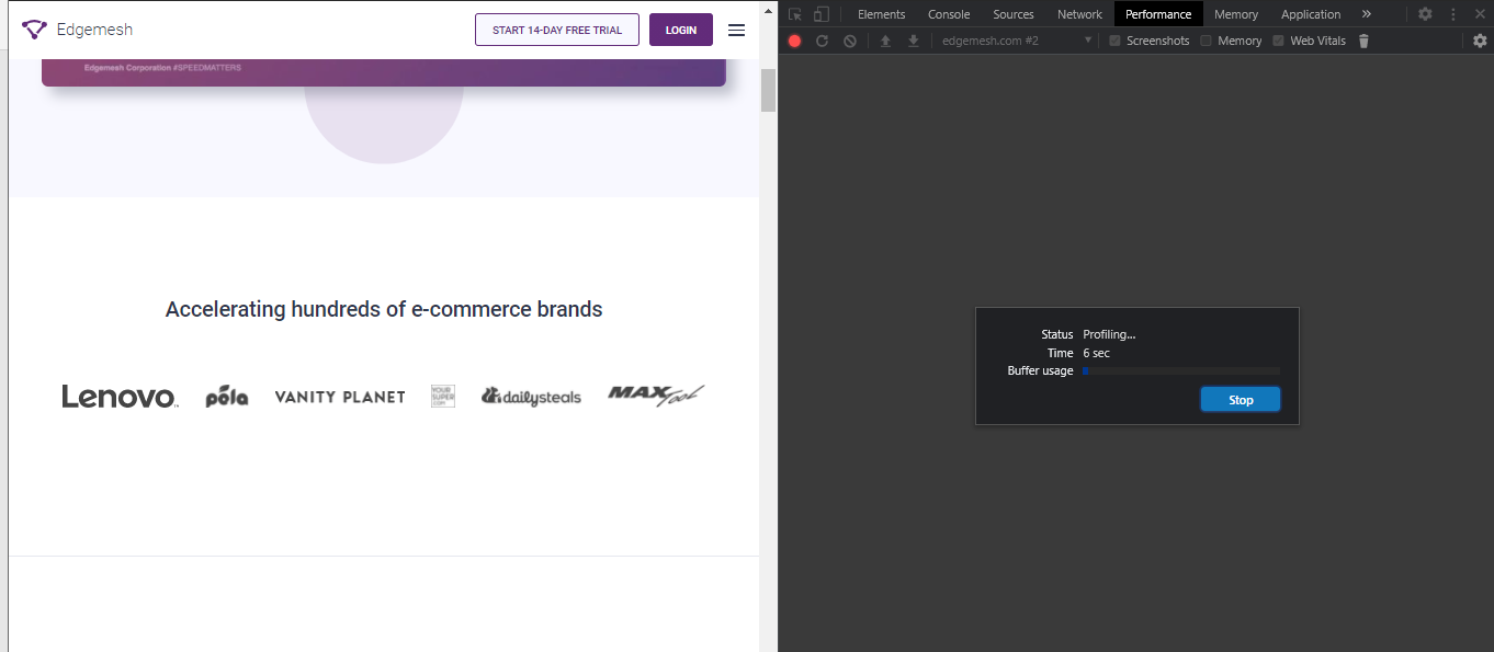
- Below is an example of what it should look like while it’s profiling your website.
- When you get a full reloaded screen, you’ll get a screen full of random charts which can look confusing at first —but don’t fret.
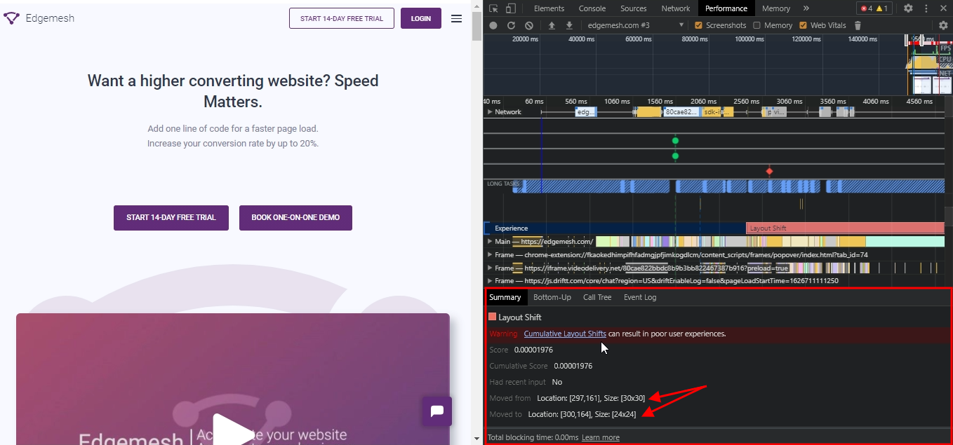
- Scroll down to the “experience” section and click on “Layout Shift.”
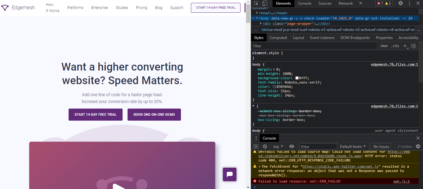
- You’ll get a summary of your results below the whole section, including what elements on your page moved and from where to where.
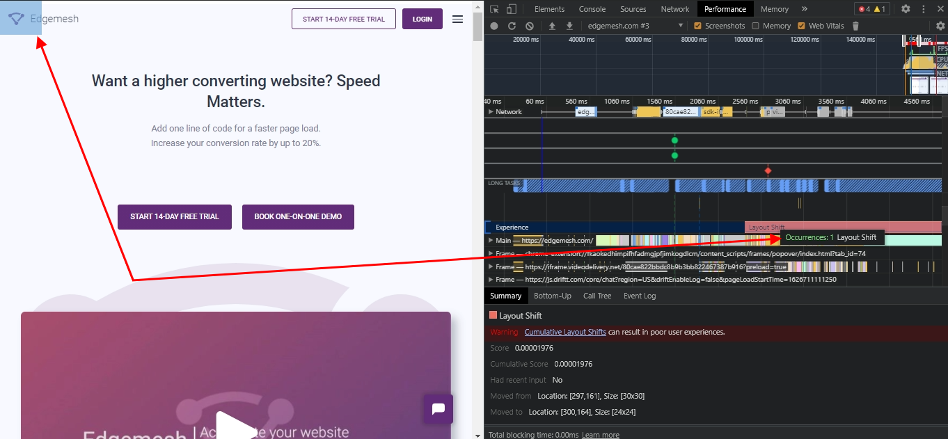
- If you hover your mouse around “Layout Shift,” you can pinpoint what elements on your page moved.
— In our case, we had one occurrence and it was our logo.
- If in your case, you have several occurrences, you’ll have them all listed below in the “summary” tab along with how they’ve moved.
- The results above showed the cumulative layout score, but it’s not in a measurable unit —yet.
— To get an accurate measure of your CLS score, move your mouse over to a “red-shaped rhombus” — and click it.
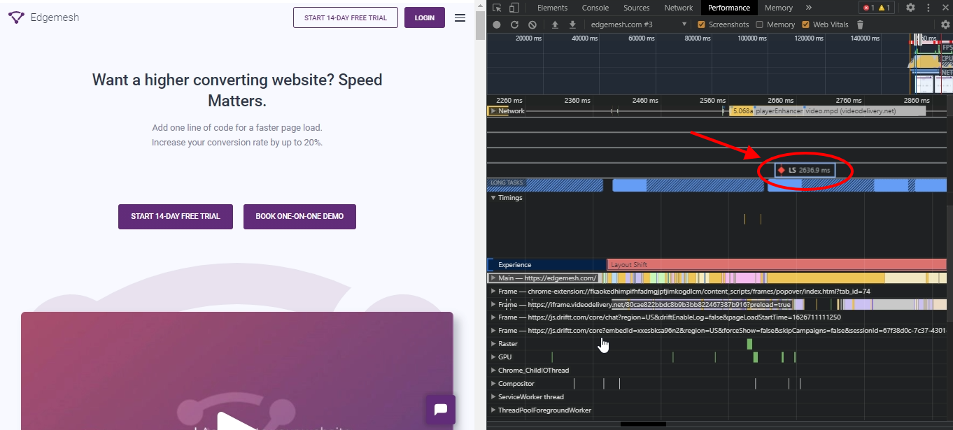
- You’ll get a measurable unit of your CLS, and below are frames involved in it.
But there’s a fault in the result…
Looking at our result, Chrome Dev Tools showed our CLS as 2636.9ms, which is way beyond Google’s recommendation. Investigating the cause showed that a simple logo on the page was responsible for this.
But how is this possible? There could be other variants on the website that could trigger different element moves — but the focus of this Lab tool is focused on the final result at that point in time. The chances of you getting a completely accurate result score using the tool is less than 100%. Meanwhile, it’s a starting point in understanding how certain elements on your website are affecting user experience.
You can try testing out different pages on your website, and I’m 100% sure you’ll get different results on what’s causing a drag in your CLS. The more tests you carry out, the more you can easily zero in on what exactly you need to improve.
With this, let’s try out a Field tool in knowing our CLS score —this time, with PageSpeed Insights.
How to Use PageSpeed Insights to Find Your CLS
- Your first step is to head over to PageSpeed Insights — and you should have something like this below.
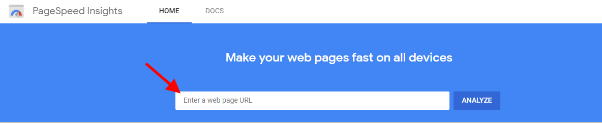
- Input your web address — or any functioning website address you’d like to know its LCP and click on “analyze.”
For this, we’d be using our website again, Edgemesh.

- When using PageSpeed Insights to get your LCP, you can toggle between knowing the score on mobile and desktop.
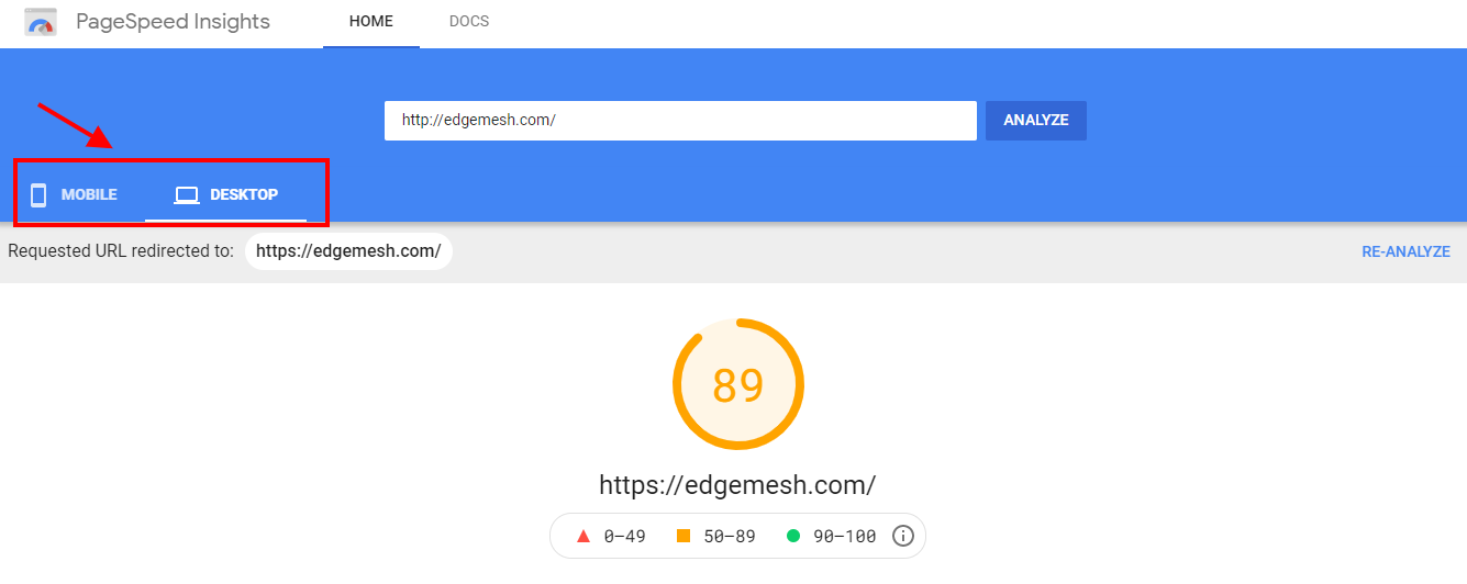
The reason for this is due to the differences in user experience on different devices. Factors such as page load time, page size, website content, etc. also contribute to this.
- Scroll down a little bit and you’ll find your CLS.
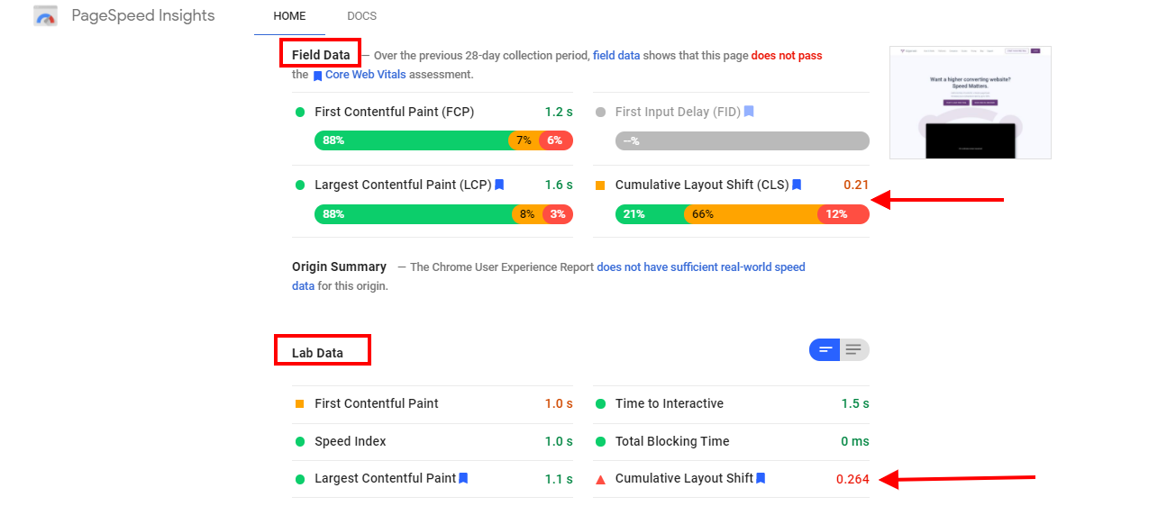
- Common to PageSpeed Insights results, you’ll find results both in Field and Lab data.
The results you get from both tools will likely be different as they are run on different simulations. Nonetheless, these disparities won’t be far off.
- As you scroll down further, you’ll see the audits conducted by PageSpeed Insights, along with its recommendations under the “diagnostics” tab.

- You can choose to go through the diagnostics and see the cause of the layout shit on your website.
Understanding how to identify your CLS and knowing what elements on your website are responsible for any layout shift—though a bonus, doesn’t solve all your problems. Agreed! You know the problem, but what about the causes of poor CLS? What if it happens next time? What if a click of a button doesn’t solve the next problem?
All these and many more are reasons you should not only know how to identify it, but also know the cause.
Factors Responsible for Poor CLS
With Google putting the main priority of Cumulative Layout Shift in visual stability, there are 5 main factors responsible for hindering a user’s visual experience.
They include:
- Ads, embeds, and iframes without dimensions
- Images and videos without dimensions
- Web fonts causing FOUT and FOIT
- Dynamically injected content
- Actions waiting for a network before updating DOM
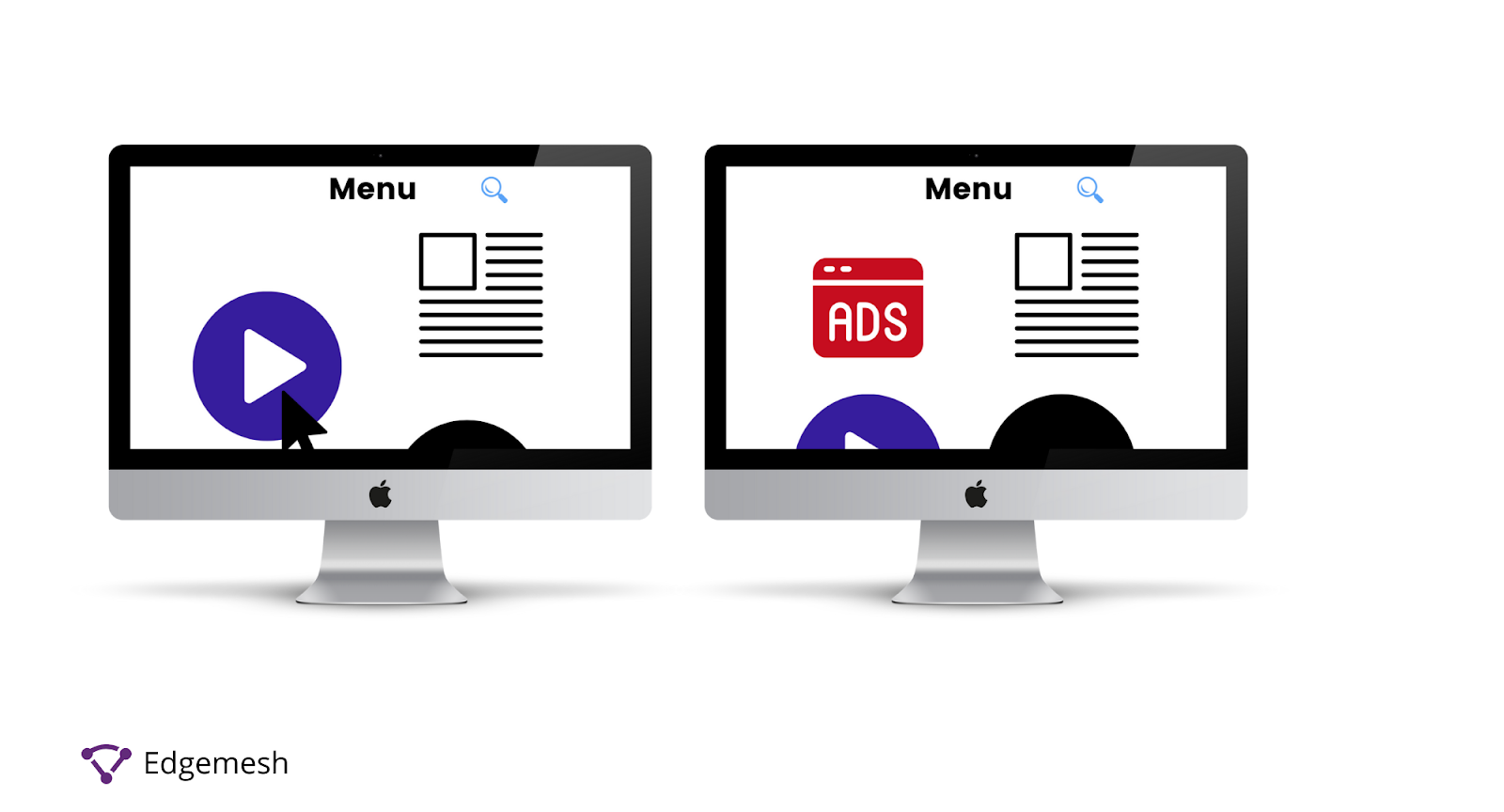
1. Ads, Embeds, and Iframes Without Dimensions
The sizes of ads being displayed on a website are one of the key determinants in its click-through rates. In most cases, the browser rendering these ad images and embeds doesn’t know what dimensions these ads are set in. The same goes for iframes. And when this happens, it causes a layout shift on the page it’s on, thereby pushing relative content down the page. This affects the overall user experience and leads to poor CLS.
Here’s an example of how an ad on Forbes affects user experience:
- Primary location before the ad popped up.
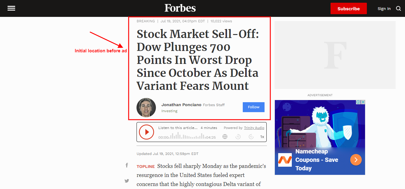
- A new ad pop-up occupied the primary location of the main content, thereby pushing it down and causing a layout shift.

2. Images and Videos Without Dimensions
Just like ads, images and videos without dimensions on web pages change the whole layout of content. The main issue with these elements falls on the site owners not including width and height size attributes when uploading them. By not doing this, the browser will automatically allocate an estimated aspect ratio for them depending on the device used to access the website. Through that, the images and videos will resize to fit the intended viewport, thereby causing a significant shift in layout.
Below is a typical example from web.dev on the layout shift caused by images without dimensions.
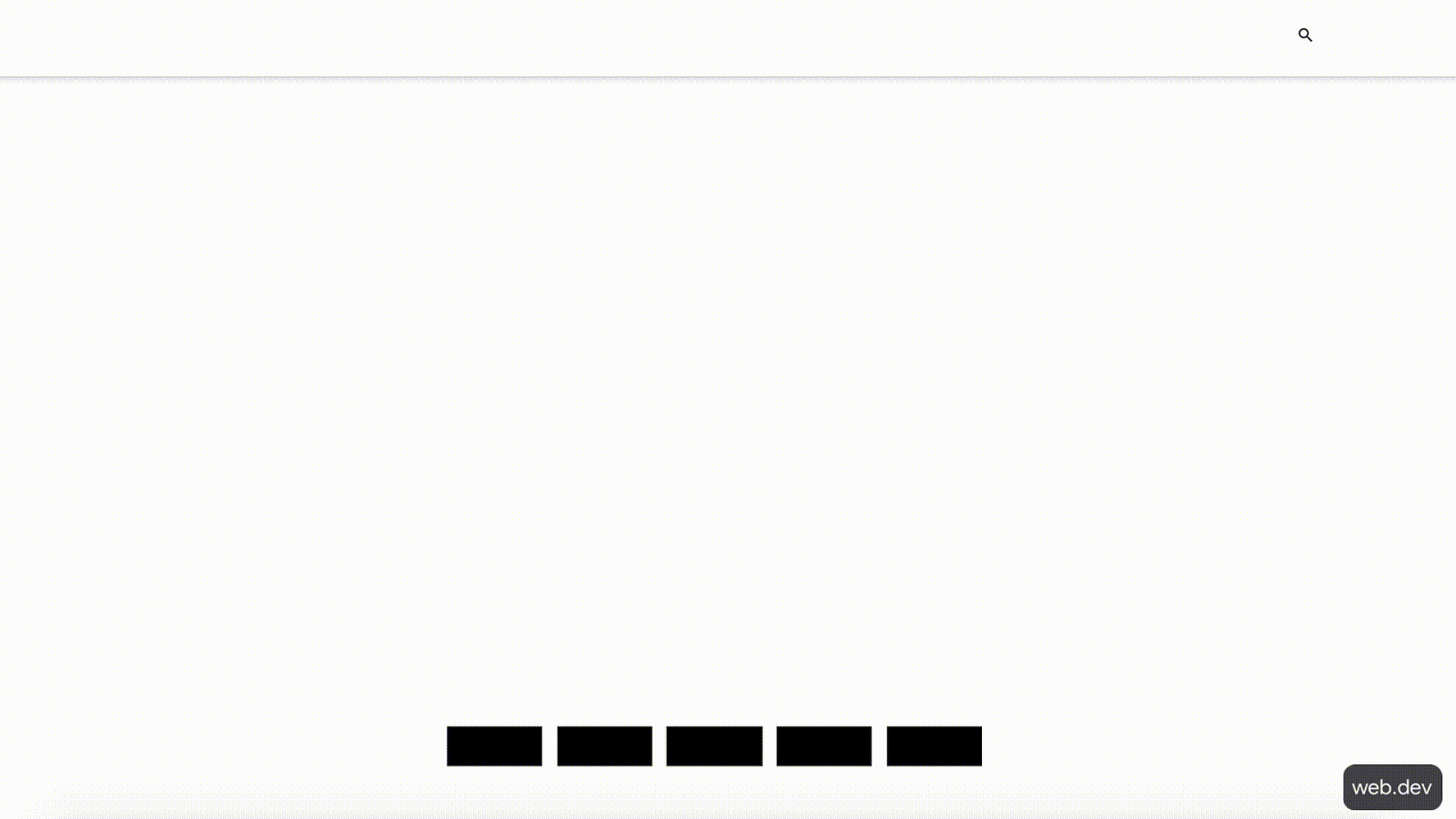
Without specified dimensions for elements such as images and videos, the browser when loading the page will not know how big or small the element is. As such, it will move content around the page till they find a fit.
3. Web Fonts Causing FOUT and FOIT
The more legible your font, the better the reading experience will be. If you have a font that takes a while to load, it leads to a series of unpleasant layout shifts.
When it comes to fonts causing poor CLS, it’s as a result of either of these two:
- FOUT (Flash of Unstyled Text)
- FOIT (Flash of Invisible Text)
- Flash of Unstyled Text (FOUT)
FOUT occurs when the text of the content of a web page is not in its default font style, and as a result during the page initial load, it displays in a poorly slant or no-so-legible style. You might have noticed it on some websites. If you haven’t, here it is below.
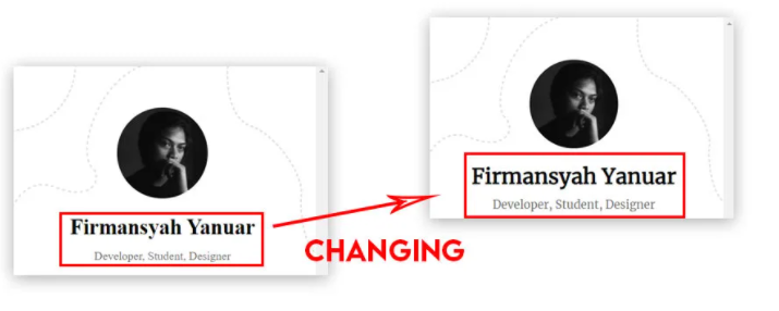
If you notice, when the original font is ready, it immediately replaces the substitute font. When this happens, a shift in the content layout is inevitable.
- Flash of Invisible Text (FOIT)
In the case of FOIT, it occurs when the original font of the content of the web page takes time to load. Unlike FOUT where an unstyled text will be temporarily displayed, in FOIT, no text will be shown, hence, creating a blank screen until the main custom text is ready. This delay in font loading causes a shift in the layout and structure of the content once it’s loaded.
A quick example:

4. Dynamically Injected Content
Injecting new content into existing content at the top of the page is the most common way of ruining your overall CLS score. Elements mostly responsible for these are ads, promo banners, YouTube videos, social media posts, Google Maps, and random pop-ups (e.g., squeeze pages). The introduction of these new elements on the page creates a massive layout shift to the whole content.
A website like Creative Bloq falls victim to this:
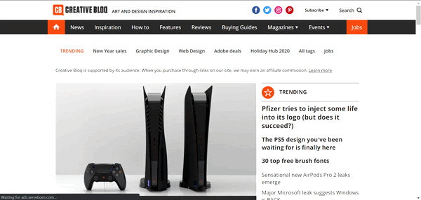
Immediately, the ad is displayed on the page, the layout of the entire content shifts to a whole new place. This type of layout shift will affect user experience, and in turn, lead to poor CLS.
5. Actions Waiting for A Network Response Before updating DOM
The DOM (Document Object Model), in this case, is an HTML API that represents the structure of the web page or document —and this way, programming languages can access and modify the structure. In simpler terms, the DOM helps parse the content of an HTML document into a readable and standardized object for programming languages such as JavaScript to easily access, and modify. If certain actions on a web page (e.g., animations) take a while to get a good network response from the server and back to the browser before updating the DOM, there’ll be a massive layout shift when it finally updates.
This way, when the animation is completely loaded, it alters its initial location on the web page. Now that we’ve covered all the factors responsible for causing poor CLS, here are ways to fix it.
How to Fix Your Poor CLS
Ordinarily, installing a plugin on your website doesn’t solve your CLS problem 100%. A new blog post, new ad, new animations, and other possible causes could trigger it again — and you’re back to where you started. But it doesn’t have to be like that if you know some of the best practices to help you keep your CLS very low.
Below are ways you can use to fix your poor CLS:
1. Use Aspect Ratios for Images and Videos
Images and video elements on your website need to have widths and height attributes before you upload them. It should be your first move to reduce your CLS. By doing this, UA stylesheets from browsers (especially on mobile) will help you modify the element’s width and height attributes by adding the default aspect ratio to prevent shifts in layout.
2. Preload Web Fonts
When a page is rendering, the browser doesn’t treat all of the elements on the web page as a priority. Fonts, in most cases, are the lowest priority. You can preload your web fonts so browsers can treat them as a high priority when rendering pages. A good way to do this is to use the Font Loading API introduced by Google. With this, the browser will include the fonts (preferably your most used fonts) in the First Meaningful Paint.
Along with the page’s main content, the initial font of the text on the page loads with it, and no layout shift occurs.
3. Manage Ad Space
The aspect ratios of ads influence the on-page experience for users on their end. It gets even worse if the ad is dynamic and unstable in one part of the page. The best way to fix this is to manage space for ads — preferably one that doesn’t affect user experience.
The best ways to do this:
- Use of a placeholder if an ad doesn’t display on time or disappears without returning. Never collapse the viewport for an ad.
- Reserve the biggest available space for ads based on frequently used aspect ratios of ads displayed on your website.
- Avoid putting ads at the top of the page —rather, put them in the middle.
4. Reserve A Space for Embeds and Iframes
The best way to manage embeds and iframes goes hand-in-hand with the same recommendations for ads. Primarily, you should create more than enough space for these elements —so much that when they get displayed, they don’t create a shift in the content. Instead, they occupy a ready-made space for them without altering anything.
Conclusion
The more you understand Cumulative Layout Shift, the more you’ll be able to optimize your website for a better user experience. Compared to other performance metrics in Google’s Core Web Vitals like Largest Contentful Paint, CLS isn’t a major game-changer, but it’s an important score. Before we wrap up, what’s your current CLS score and are open to improving your overall page load time for a better user experience? If customer experience, good conversions, low bounce rates, and overall — speed — matter to you, you’ll love Edgemesh’s Enterprise-Grade Web Acceleration.
With our intelligent, automated, and next-generation client-side caching, your website is ready to move at a full speed — with just a single line of code.
Plus, it takes less than 5 minutes to set up, so what do you say?
Start your 14-day trial and learn what speed can do for your business.


